To improve the appearance and readability of your presentations, you can change the formatting of the panels (or "frames") that contain each of your visuals. These formatting options determine the panel's general look and feel (shadow, title font, and so on) as well as the formatting of its title and subtitle. In Present only, the style also specifies the appearance of the panel tools that are available at runtime.
The following visual types are contained within panels that you can format:
- Discoveries and legends.
- Visual areas from Tabulate spreadsheets.
- Containers for mini tabs or table layouts.
- Slicers.
Note: These settings are similar to the Caption Settings in Publish.
Impact of Formatting Changes
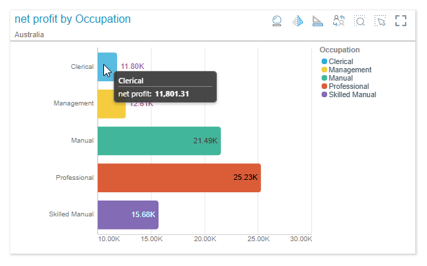
Changing the Panel Settings changes what the panel or "frame" (rather than the visual it contains) looks like at runtime. The following example shows a Bar Chart visual in a panel with the "Classic" style applied using the Formatting panel's Style dropdown list. The style and other formatting options affect the shape, border, and shadow associated with the panel, the Panel Tools shown at runtime (Present only), as well as the position and styling of the title and subtitle.
- Click here for runtime examples of each possible preset panel style
Formatting Panel
Common options
At the top of the formatting panel are some general settings:
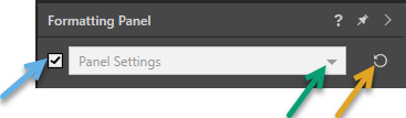
Note: The preceding example shows the Panel Settings for a linked or "shareable" visual.
- The Show Panel checkbox (blue arrow above) shows or hides the panels. If this checkbox is cleared, the selected visual or visuals are still shown but they are not contained within a "frame" with a title or subtitle.
- The Formatting dropdown list (green arrow) allows you to select the type of Formatting that you want to edit. This topic describes the settings associated with any of the Panel Settings selections:
- Panel Settings:These options format the panel containing the visual when it is rendered; indicating its general look-and-feel and the look-and-feel of its title and subtitle.
- Slide Panel Settings:These options control the same formatting as Panel Settings, but they apply to every panel on this page.
- Presentation Panel Settings:These options control the same formatting as Panel Settings, but they apply to every panel in this document.
- Click Reset (orange arrow) to reset the formatting back to the default selections.
These options all open the details on the Settings, Title, and Subtitle tabs (below), but in each case the scope of application is different.
Note: This topic is all about the Panel Settings. If you see other options on this dropdown list, such as the Report Title or the Data Labels, you can find these details in the Discover help. For more information, see Formatting Panel in Discover Pro.
Settings Tab
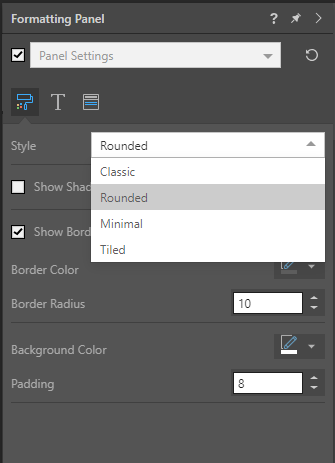
- Style: The preset styles that you can apply for your panels. Can be one of Classic, Rounded, Minimal, and Tiled.
- Show Shadows: Show or hide the shadow underneath your panel.
- Borders:
- Show Border: Show or hide the border around your panel.
- Border Color: Select the color for your borders.
- Border Radius: Increase the border radius to make the panel corners curved.
- Background Color: Select the background color for your panel.
- Padding: Set padding for the panel to determine how close the visual elements and title are to the panel edges.
Note: Colors are set using the Color Picker.
Styles
- Classic - The panel has square corners, a shadow, and a dividing line between the title and the visual. The title is shown in the top-left corner. For presentations only, at runtime, the panel tools are shown at the top-right when hovering over the visual.
- Rounded - The panel has rounded corners and a black outline. The title is shown in the top-left corner. For presentations only, at runtime, the panel tools are shown at the top-right when hovering over the visual.
- Minimal - The panel has square corners and a shadow. The title is hidden. For presentations only, at runtime, the panel tools are shown as a pop-up above the visual when hovering over it.
- Tiled - The panel is totally flattened; there is no outline or shadow. The title appears at the top left corner. For presentations only, the panel tools are shown at the top right when hovering over the visual.
Title Tab
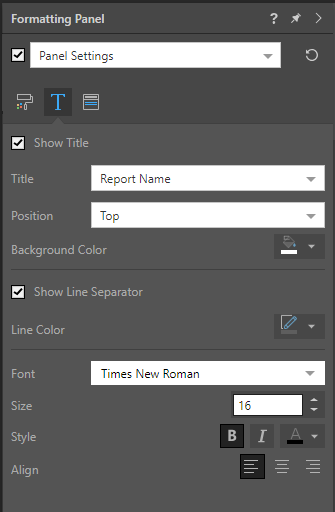
- Show Title: Show or hide visualization titles.
- Position: Position the title along the top or bottom of the visual.
- Title or Type: This option is only available where your changes will apply to one panel. The options are:
- Visual Area Name (Tabulate) - Use the name for the visual area from Tabulate.
- Auto (Discover) - Automatically assign a name based on the measures and members within the query.
- Report Name (Discover) - Use the name for the visual from Discover.
- Custom - Type a custom title for your visual.
- Background Color: Select a background color for the top title panel using the Color Picker.
- Line Separator:
- Show Line Separator: Show or hide the line that separates the title panel from the visual.
- Line Color: Select a color for the line using the Color Picker.
- Font: Change the font type, size, emphasis, alignment, and color of the title text.
Subtitle Tab
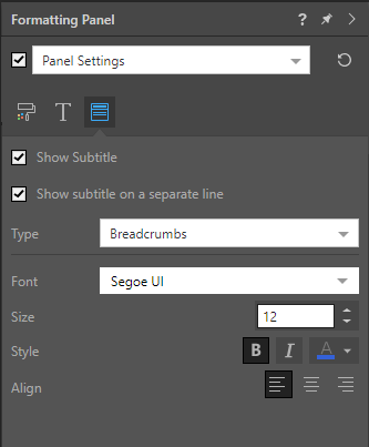
- Show Subtitle: Show or hide the visual's subtitle.
- Show subtitle on a separate line: Either show the subtitle beneath the title (select checkbox) or show the subtitle on the same line as the title (clear checkbox).
- Type: This option is only available where your changes will apply to one panel. The options are:
- Breadcrumbs - Show the breadcrumb trail as the subtitle.
- Custom - Specify a custom subtitle.
- Font: Change the font type, size, emphasis, alignment, and color of the subtitle text.